
We've picked out 11 of our favourite infographics. Together they create a beginners guide to internet marketing, search engine optimisation, content marketing and social media marketing.
If you’re new to internet marketing, these infographics are a great place to start. And if you know your way around the world of internet marketing pretty well, we hope this blog post forms a useful bank of statistics for you.
1) The Periodic Table of SEO Success Factors (published 2013)
This infographic clearly explains the most important factors involved in SEO. It splits these factors into two groups, On-The-Page and Off-The-Page Factors with an explanation for each. Rating and colour coding the different factors between +3 for really effective SEO tactics and -3 for harmful practise, makes it obvious which to use and which to steer clear of.

Take away: Make sure you (or your SEO agency) only employ SEO tactics that have a positive rating in this table.
2) The Blogconomy (published August 2013)
The infographic starts with the heading “why blogging is good for your business”. Then it goes on to list over 50 different stats/pieces of information on blogging. Thanks to the hard work done by ignitespot collecting all of these valuable figures into one resource, it’s easy to see why and how blogging will grow your business.
 |
| Click for full infographic. |
Take away: If you don’t blog, start now. It generates leads and will boost your website’s visibility in Google search results.
3) The Ultimate Guide to Social Media Image Dimensions (published February 2013)
We really like this infographic because it’s so useful! Anyone setting up or refreshing their company’s social media profiles will need to navigate the tricky world of multiple profile image and channel art dimensions. Thankfully, this lovely infographic collects all of this information in one place.
 |
| Click for full infographic. |
Take away: Don’t settle for stretched images on your social platforms. Get them right.
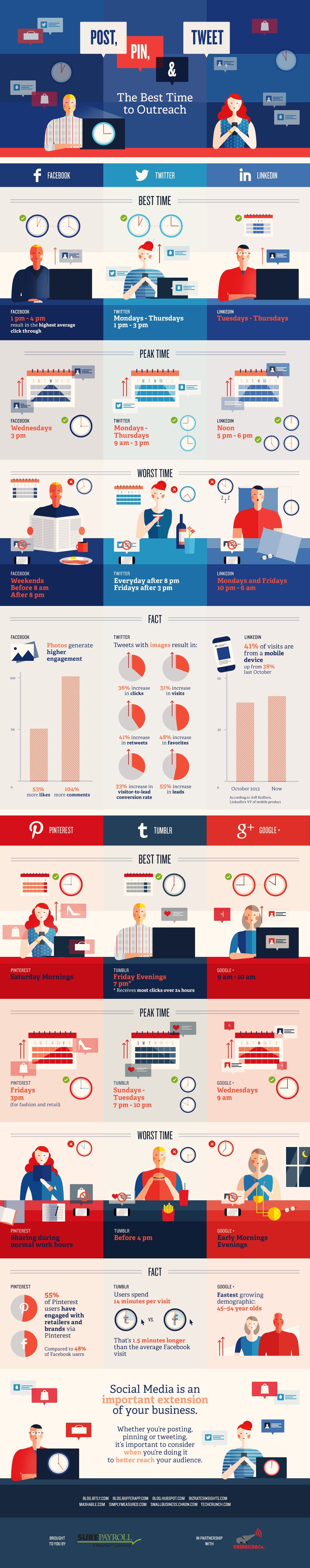
4) The Best Times to Tweet, Pin, Tumble and Post (published May 2014)
One of the most common questions our clients ask on the topic of social media, is when should I Tweet, Facebook or post to Google+, this infographic puts this information at the tip of your fingers for the 6 most used social platforms.
 |
| Click for full infographic. |
Take away: Be strategic about when you post on social media to see more engagement.
5) 22 ways to Create Compelling Content (published February 2012)
We talk a lot about content here at angelfysh. And rightly so. It’s one of THE most important factors when it comes to getting your website to the top of Google search results. unfortunately, deciding what to write about isn't always easy. This infographic has 22 ways for you to get your creative juices flowing.
 |
| Click for full infographic. |
Take away: Get blogging!
6) How to Increase LinkedIn Engagement by 386% (published December 2013)
This infographic has some great tips on how to take your LinkedIn use from personal networking to generating leads and revenue for your business. It includes useful information such as when to post, and what to talk about.
 |
| Click to see full infographic. |
Take away: Include links or images in your LinkedIn updates.
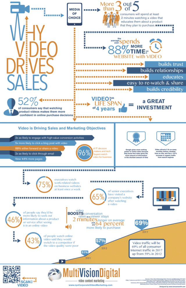
7) Why Video Drives Sales (published October 2013)
Content marketing isn’t just about written content, it includes video too. This infographic shows why every company must include videos as part of their marketing strategy – e.g. 75% of executives watch work-related videos on business websites at least once a week. And! Video traffic will account for a huge 69% of all consumer internet traffic by 2017.
 |
| Click to see full infographic. |
Take away: Don’t just leave video to the ‘big players’ in your industry. Take the lead and add videos into your internet marketing strategy.
8) Mobile Marketing (published May 2012)
Did you know that 46% of users who view a product on their phone are actually standing in the store? And by 2015 43% of mobile users will make purchase on their phones. This infographic contains loads of great statistics on mobile usage which you can use to inform your mobile marketing strategy.
 |
| Click to see full infographic. |
Take away: Make sure your website is responsive. A responsive website will resize to fit the screen (laptop, tablet, mobile etc.) being used to view the website.
9) The New Multi-Screen World (published August 2012)
Google has created this neat little infographic which contains some really interesting information on cross-platform consumer behaviour. By cross platform we mean shoppers who use more than one device in their buying journey. For example, 67% of people use two devices when shopping such as a phone and a computer.

Take away: Make sure your website is responsive, easy to navigate and easy to checkout on multiple devices.
10) Why Visual content Marketing Delivers Results (published September 2014)
This is really an infographic on why infographics work! If you’re still to be convinced of their merit here are some statistics that will leave you without any doubt of their effectiveness to engage.
 |
| Click for full infographic. |
Take away: What subject could you create an infographic on to engage new leads or customers?
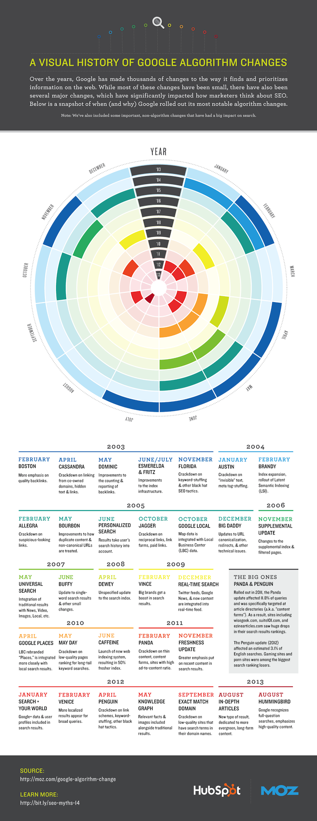
11) A Visual History of Google Algorithm Changes (published February 2014)
This infographic will give you a snapshot overview of the background of SEO today. It eloquently summarises the changes Google has been making to the way it finds and ranks websites over the last decade.
 |
| Click for full infographic. |
Take away: Google will favour websites with quality content and quality links.
We hope you've found this interesting! If you've got a favourite infographic, please let us know in the comments below. Please also share this post with your own followers. Thank you.