
angelfysh has been working with Sage Gateshead now for 4 months on improving search engine visibility and helping the website to convert more visitors into ticket sales.
To say we're pleased with how things are going is an understatement.
During the months of May, June, July and August 2014 there's been an increase of 47% in revenue generated from ticket sales alone compared to the same period in 2013.
Of course we can't take all the credit as Sage Gateshead have their own strong marketing team and also work with Newcastle based Brand Consultants Violet Bick.
Thanks for reading.
Showing posts with label conversion rate optimisation. Show all posts
Showing posts with label conversion rate optimisation. Show all posts
Tuesday, 2 September 2014

Monday, 25 August 2014
How to get more customers to complete your website checkout – Part 2
Today, we’re continuing on with more practical advice on what you can do to see more customers complete checkout.
A lot of effort goes into actually getting a customer to a website. Just think about everything you’ve done as a business owner to get your name and product out there. This only makes it more frustrating when a significant proportion of these visitors start the checkout process but then never complete it.
In this blog post we’ll guide you through another 6 tips that will make your checkout process easier, more user friendly and streamlined.
Have a persistent shopping cart
This is top of the list of our recommendations today. A persistent shopping cart is one where the items will still be there if the shopper goes away or is in active for a while. It means that they can come back and easily make the purchase later on.
I left some shoes in the basket for a whole day on the Crocs website. And when I came back, they were right where I left them.

Make the primary button stand out
One key to easy checkout navigation is having a single, most prominent button on each page. This makes it clear to the user where they need to go intuitively. Where there are multiple options, the most important or desired action must be stronger. Being consistent with the design and positioning of this primary button will make your checkout navigation easy to use and intuitive.
Urban outfitters do this well. Everything on the page is monotone, except for the primary button which is bright blue. This is consistent throughout the checkout process.

Autofill address
If you’re an ecommerce store, all your customers really want is to have the right product in their hands. Anything that you can do to make that happen quicker and easier is of benefit to your business. This includes details as seemingly insignificant as whether you provide an autofill for their address after they’ve entered their post code. Equally important is allowing delivery details to be used as billing details. Time saving optimisations like this will become increasingly important as more and more users make online purchases using their mobile phones.
We like the way Firebox has kept the number of fields to a minimum, they'll find your address using your post code and they also autofill title and country. Sensible defaults like these save customers time and effort.

Provide helpful error messages
It’s more than a little frustrating when you go through the trouble of filling a form out, then you press submit but for some reason it’s not happy and wants you to fill it all out again.
It’s really important that when there is an validation error, the correct information that the customer has typed is retained. Secondly, a useful error messages needs to be given. Often these messages are displayed at the top of the page, instead they need to be alongside the field containing the error as this makes is so much easier to spot and correct.
Schuh give concise and helpful error messages when something's not quite right.

Offer gift options
A huge proportion of our online shopping is for gifts. Just take Mother’s Day for example, 60% of gifts are bought online. With birthdays and anniversaries the need for gift wrapping options becomes obvious.
It’s not just gift wrapping options that a customer might look for, they might want to conceal the price or include a ‘don’t open before [date]’ note. Implementing these considerations in your checkout process will make your customer feel valued because you thought about their needs.
Hotel Chocolat do this amazingly, not only do they offer you several gift options, they show you what they look like.

Display basket items
This keeps the user focused on the end goal – their shiny new thing. The Nike website displays the products being purchased throughout the checkout process, it’s nicely done with beautiful product imagery.

There are 6 more checkout optimisation tips in last week’s blog post, which you can read here. Enjoy!
Also, we’d love to know if any of you have implemented any of these recommendations and the impact it’s had on your conversion rate. Let us know by commenting further down.
Oh and if you've found this article useful please share it using the icons below.
Oh and if you've found this article useful please share it using the icons below.
Monday, 18 August 2014
How to get more customers to complete checkout on your ecommerce website – Part 1
Sometimes it’s hard to put your finger on what makes a website great... it just feels ‘nice’ doesn’t it? This doesn’t happen by accident or by having better designers but by deciding to put user experience (UX) first.
In this article we’ll be sharing six techniques that really successful websites use to make their checkout experiences feel ‘nice’. If you can incorporate just some of these intentional user focused decisions in your website then you’ll be well on the way to seeing more checkout completions and fewer shopping cart abandonments.
Did you know that 25% of shoppers abandon their cart because of forced registration? That’s 25% of sales that have been lost. Even mentioning the word ‘register’ in your checkout is a bad idea because it makes some customers feel like they’re not in control of the checkout process.
Instead of making customers register as default, try offering the option for first time buyers to checkout as a guest and once they have completed their purchase then offer the option to register.
A website which does this well is ASOS.

We all want to know that the website we’re purchasing from is secure, especially if we’re using our mobile phone to access the website and buy.
Websites should display SSL certificates and logos ensuring security throughout the checkout process, not just on the payments page. And on the payments page there should be a short piece of text reassuring visitors that the website is secure.
Something else that we’ll mention is, make sure you also provide information on what exactly a security code or expiry date is. This is something that Quicksilver have done nicely.

Much of what we've talked about so far comes down to one thing: making the customer feel in control. Informing the customer where they are in the checkout process, what step is coming next and allowing them to navigate forwards and backwards through these steps hands them the reigns and relieves any worries they might have.
This can be effectively done in a process bar showing the checkout steps. Each step should be a clickable link in case the customer wants to go back and change anything.
We like the way Lakeland has done this and even included a brief sentence to let customers know what to expect from each stage.

Sales completed on mobile devices grew by 94% from 2012 to 2013 and now account for more than 32% of all online sales.
In light of this and the fact that a mobile screen is so much smaller than a desktop screen, your checkout process has to be mobile friendly. This means keeping the design simple, using radio buttons and drop down menus where possible and only asking for the most essential information.
TopShop have a great mobile checkout which is easy and quick to follow, and it ticks all of the other best practises in this article.

It’s really important that there are no unnecessary navigation or exit points in your checkout process. Since you've worked so hard to get your customer to the point of buying, everything should be focused on moving your customer along the checkout process and not away from it. There should be a limited or no menu navigation. Only information relevant to encourage completion should be included, such as: guarantees, returns policy and delivery information.
Notonthehighstreet are a shining example of how to do this:

Not only is this helpful to shoppers, it’ll increase your average transaction value. But you must up-sell in the right way by offering only the most relevant products. Apple is a great example of this they've kept it simple and still kept the continue button the most prominent on the screen.

PayPal is fantastic. Instead of having to rummage around for your card and type out the really long card number you can just enter your email address and hey presto the payment is made.
Wiggle not only provides the option of paying by card or PayPal, it also clearly explains what to expect and when to enter your PayPal details.

That's it for Part 1 of How to get more customers to complete checkout on your ecommerce website. Part 2 to follow next Monday.
Please share this post if you found it useful.
Thank you.
In this article we’ll be sharing six techniques that really successful websites use to make their checkout experiences feel ‘nice’. If you can incorporate just some of these intentional user focused decisions in your website then you’ll be well on the way to seeing more checkout completions and fewer shopping cart abandonments.
Allow customers to checkout as a guest
Did you know that 25% of shoppers abandon their cart because of forced registration? That’s 25% of sales that have been lost. Even mentioning the word ‘register’ in your checkout is a bad idea because it makes some customers feel like they’re not in control of the checkout process.
Instead of making customers register as default, try offering the option for first time buyers to checkout as a guest and once they have completed their purchase then offer the option to register.
A website which does this well is ASOS.
Include secure payment information
We all want to know that the website we’re purchasing from is secure, especially if we’re using our mobile phone to access the website and buy.
Websites should display SSL certificates and logos ensuring security throughout the checkout process, not just on the payments page. And on the payments page there should be a short piece of text reassuring visitors that the website is secure.
Something else that we’ll mention is, make sure you also provide information on what exactly a security code or expiry date is. This is something that Quicksilver have done nicely.
Show customers their progress
Much of what we've talked about so far comes down to one thing: making the customer feel in control. Informing the customer where they are in the checkout process, what step is coming next and allowing them to navigate forwards and backwards through these steps hands them the reigns and relieves any worries they might have.
This can be effectively done in a process bar showing the checkout steps. Each step should be a clickable link in case the customer wants to go back and change anything.
We like the way Lakeland has done this and even included a brief sentence to let customers know what to expect from each stage.
Make your checkout mobile friendly
Sales completed on mobile devices grew by 94% from 2012 to 2013 and now account for more than 32% of all online sales.
In light of this and the fact that a mobile screen is so much smaller than a desktop screen, your checkout process has to be mobile friendly. This means keeping the design simple, using radio buttons and drop down menus where possible and only asking for the most essential information.
TopShop have a great mobile checkout which is easy and quick to follow, and it ticks all of the other best practises in this article.
Remove all distractions
It’s really important that there are no unnecessary navigation or exit points in your checkout process. Since you've worked so hard to get your customer to the point of buying, everything should be focused on moving your customer along the checkout process and not away from it. There should be a limited or no menu navigation. Only information relevant to encourage completion should be included, such as: guarantees, returns policy and delivery information.
Notonthehighstreet are a shining example of how to do this:
Offer customers complimentary products
Not only is this helpful to shoppers, it’ll increase your average transaction value. But you must up-sell in the right way by offering only the most relevant products. Apple is a great example of this they've kept it simple and still kept the continue button the most prominent on the screen.
Provide multiple payment options
PayPal is fantastic. Instead of having to rummage around for your card and type out the really long card number you can just enter your email address and hey presto the payment is made.
Wiggle not only provides the option of paying by card or PayPal, it also clearly explains what to expect and when to enter your PayPal details.
That's it for Part 1 of How to get more customers to complete checkout on your ecommerce website. Part 2 to follow next Monday.
Please share this post if you found it useful.
Thank you.
Monday, 11 August 2014
6 e-commerce website best practice examples
A little while ago we wrote an article on 15 e-commerce best practices that you can’t ignore - no longer is Google only concerned with factors such as meta data and alt tags.
Google wants to see websites that are user friendly. So build your website for the user and you’ll be on the right path to seeing your Google rankings improve as visitors stay longer on your website, make more purchases and keep coming back.
The examples below are all websites that put customer experience first, and as a result have come out on top of Google too.
Made.com have really put a lot of consideration into providing images of their products. Each product page contains photos of the piece of furniture from every angle, close ups of the fabrics and materials, images with the dimensions clearly labeled, and showing the relative size of the piece compared to a person. What more could you ask for without actually touching it?

In the end; the more attractive, juicy, stylish and high quality a product looks the more confident your customers will be when buying online.
Trust is a huge factor in online retail. Delivery and returns information must be easy to find and adhered to unfailingly by e-commerce websites. These two topics are ‘pain points’- in fact 44% of carts are abandoned because of high shipping costs. Being upfront about delivery and returns ensures that the customer doesn't feel like something's been sprung upon them.
Notonthehightstreet.com does a great job of this, giving delivery dates and prices for several UK and international delivery options as well as a simple returns policy. Both these pieces of information are available on the product page allowing customers to continue with their shopping uninterrupted.

Mark Cuban, an American billionaire said this: "Make your product easier to buy than your competition, or you will find your customers buying from them, not you".
Speedy repeat purchases not only helps your customers, it helps you! Amazon the kings of e-commerce lead the way with this offering purchase with just one click. For websites who have many returning customers this is a must.

Deals on your homepage will grab your customers’ attention when they arrive; this is crucial if you want to stop them from hitting the back button. Bestsellers work really well on the homepage because they get customers to their favourite products even faster.
You've heard the saying, you are what you eat; well, e-commerce websites are what they sell. By having your bestsellers and deals on your homepage customers can easily see what you’re about, the price bracket you sell in and if you make use of reviews how much your customers have loved your products. B&Q do a great job of this.

According to Reevoo, onsite reviews produce an 18% increase in sales on average. That’s huge. Just think what you could do if you had 18% more income from your website.
So who’s doing this well? The North Face have a well thought through review system tailored to each category of product. What we like about this review system is the use of tick boxes and sliders, great if you don’t want to write loads!

As well as showing star ratings on the product category pages this website actually highlights products with the most reviews and the best ratings.

Thank you pages are often overlooked as they come at ‘the end’ of the customer journey, but if you can retain your customers then you've won half the battle. Thank you pages give you the perfect opportunity to leave your customers feeling appreciated and looked after.
Jezz Bezos, the CEO of amazon.com said this: “If you do build a great experience, customers tell each other about that. Word of mouth is very powerful”.
Here’s one thank you page that we like, masterofmalt.com, as it makes it really easy for customers to quickly leave a review and to stay in touch.

Hope these examples have given you a little inspiration to put to work on your website. Let us know if you've got any favourite examples of the these e-commerce best practices.
Google wants to see websites that are user friendly. So build your website for the user and you’ll be on the right path to seeing your Google rankings improve as visitors stay longer on your website, make more purchases and keep coming back.
The examples below are all websites that put customer experience first, and as a result have come out on top of Google too.
Great use of product images
Made.com have really put a lot of consideration into providing images of their products. Each product page contains photos of the piece of furniture from every angle, close ups of the fabrics and materials, images with the dimensions clearly labeled, and showing the relative size of the piece compared to a person. What more could you ask for without actually touching it?
Easily accessible delivery and returns information
Trust is a huge factor in online retail. Delivery and returns information must be easy to find and adhered to unfailingly by e-commerce websites. These two topics are ‘pain points’- in fact 44% of carts are abandoned because of high shipping costs. Being upfront about delivery and returns ensures that the customer doesn't feel like something's been sprung upon them.
Notonthehightstreet.com does a great job of this, giving delivery dates and prices for several UK and international delivery options as well as a simple returns policy. Both these pieces of information are available on the product page allowing customers to continue with their shopping uninterrupted.
Fast repeat purchase
Mark Cuban, an American billionaire said this: "Make your product easier to buy than your competition, or you will find your customers buying from them, not you".
Speedy repeat purchases not only helps your customers, it helps you! Amazon the kings of e-commerce lead the way with this offering purchase with just one click. For websites who have many returning customers this is a must.
Attention grabbing deals and bestsellers on homepage
Deals on your homepage will grab your customers’ attention when they arrive; this is crucial if you want to stop them from hitting the back button. Bestsellers work really well on the homepage because they get customers to their favourite products even faster.
You've heard the saying, you are what you eat; well, e-commerce websites are what they sell. By having your bestsellers and deals on your homepage customers can easily see what you’re about, the price bracket you sell in and if you make use of reviews how much your customers have loved your products. B&Q do a great job of this.
Onsite product reviews put to good use
According to Reevoo, onsite reviews produce an 18% increase in sales on average. That’s huge. Just think what you could do if you had 18% more income from your website.
So who’s doing this well? The North Face have a well thought through review system tailored to each category of product. What we like about this review system is the use of tick boxes and sliders, great if you don’t want to write loads!
As well as showing star ratings on the product category pages this website actually highlights products with the most reviews and the best ratings.
Well optimised Thank You page
Thank you pages are often overlooked as they come at ‘the end’ of the customer journey, but if you can retain your customers then you've won half the battle. Thank you pages give you the perfect opportunity to leave your customers feeling appreciated and looked after.
Jezz Bezos, the CEO of amazon.com said this: “If you do build a great experience, customers tell each other about that. Word of mouth is very powerful”.
Here’s one thank you page that we like, masterofmalt.com, as it makes it really easy for customers to quickly leave a review and to stay in touch.
Hope these examples have given you a little inspiration to put to work on your website. Let us know if you've got any favourite examples of the these e-commerce best practices.
Monday, 30 June 2014
6 ways to improve your bounce rate to boost SEO results
Bounce rate, as explained by Google is “the percentage of visits in which users view only a single page of your site.”
If you have an e-commerce website, your aim is to get visitors to stick around, look at your products, read about your business, put items in their basket and make a purchase – then you need to get your bounce rate as low as possible as a high bounce rate means low conversion.
Bounce rate is also used by Google to measure how relevant a website is to the search terms or keywords used to find it. This means that if a website has a high bounce rate, not only will it convert fewer visitors, its Google rankings will be negatively affected. And on the flip slide, lowering your bounce rate shows Google that your website is relevant and useful, positively impacting your rankings.
a) Firstly you’ll need to have Google Analytics set up.
b) If you’ve already done this, go to Behaviour > Site Content > Landing Pages.
c) Select Comparison View from the icons at the top right of your data table.

d) Select Bounce Rate from the (compared to site average) drop down, and you should see a chart like this:

As mentioned above, bounce rate tells Google how relevant a website is to search terms used to find the website. Driving quality, relevant, hungry-to-buy traffic is more important than getting large volumes of less interested visitors as poor quality traffic will only result in a high bounce rate.
First concentrate on ranking in Google search results for keyword terms that correlate closely to what your website is about, rather than more vague and competitive keywords with a large number of monthly searches.
One reason that visitors don’t stick around on a website is not being able to find what they’re looking for. You know the frustrated feeling; you instantly hit the back button and go to the next website in the list of search results.
Overcome this by thinking about what your customers are most likely to want, need, expect, be looking for on your website and then clearly provide a route to that information from your landing pages. (A landing page is any page that a visitor enters your website on.)
Use enquiry emails to provide you with insight into questions customer couldn't easily find the answers to on your website. You can use these questions to create an FAQ page, write blog articles on, add information to your landing pages, improve your product pages, and so on.
With the online world becoming increasingly competitive, customers have higher expectations, they’re more impatient and less tolerant of poor design. Good design now signals legitimacy, trustworthiness and providing a quality product and service.
Google actually gives redesigning the landing pages of a website as the first piece of advice to websites with high bounce rates.
Usability is just as important as design. A website which looks amazing but offers a very tedious checkout process will lose customers to its competitors. How easy a website is to use is actually a reflection of the quality of customer service provided, it will not only build trust it will keep your visitors on your website, reducing your bounce rate. You can read more about how to improve your usability here.
This is simply a website that will resize according to the screen it’s being viewed on. It’s a great way to optimise your website for those browsing on mobiles or tablets. Mobile traffic now accounts for one quarter of all web searches and 30% of shoppers say they will abandon a website if checkout is not optimised for mobile.
Additionally 57% of mobile users will leave a website if it takes longer than 3 seconds to load. Clearly, making your website accessible to mobile users can have a massive effect on reducing your bounce rate.
We've already mentioned how competitive e-commerce can be; this final point is one we couldn't leave out. Is it obvious to visitors why you are different to competitors? If you provide the best value for money, best quality product or fastest delivery service is this clearly stated on your website?
This differentiation actually comes down to brand definition. Visitors need to be given a compelling reason to stick with you rather than going back to the previous, maybe slightly cheaper but not as great, product. Providing this will keep them glued to your website and to you as a customer.
If you have an e-commerce website, your aim is to get visitors to stick around, look at your products, read about your business, put items in their basket and make a purchase – then you need to get your bounce rate as low as possible as a high bounce rate means low conversion.
Bounce rate is also used by Google to measure how relevant a website is to the search terms or keywords used to find it. This means that if a website has a high bounce rate, not only will it convert fewer visitors, its Google rankings will be negatively affected. And on the flip slide, lowering your bounce rate shows Google that your website is relevant and useful, positively impacting your rankings.
How do you find out your bounce rate?
a) Firstly you’ll need to have Google Analytics set up.
b) If you’ve already done this, go to Behaviour > Site Content > Landing Pages.
c) Select Comparison View from the icons at the top right of your data table.
d) Select Bounce Rate from the (compared to site average) drop down, and you should see a chart like this:
Now on to how to reduce your bounce rate.
1. Drive quality traffic
As mentioned above, bounce rate tells Google how relevant a website is to search terms used to find the website. Driving quality, relevant, hungry-to-buy traffic is more important than getting large volumes of less interested visitors as poor quality traffic will only result in a high bounce rate.
First concentrate on ranking in Google search results for keyword terms that correlate closely to what your website is about, rather than more vague and competitive keywords with a large number of monthly searches.
2. Focus on customer intent
One reason that visitors don’t stick around on a website is not being able to find what they’re looking for. You know the frustrated feeling; you instantly hit the back button and go to the next website in the list of search results.
Overcome this by thinking about what your customers are most likely to want, need, expect, be looking for on your website and then clearly provide a route to that information from your landing pages. (A landing page is any page that a visitor enters your website on.)
Use enquiry emails to provide you with insight into questions customer couldn't easily find the answers to on your website. You can use these questions to create an FAQ page, write blog articles on, add information to your landing pages, improve your product pages, and so on.
3. Get your website looking its best
With the online world becoming increasingly competitive, customers have higher expectations, they’re more impatient and less tolerant of poor design. Good design now signals legitimacy, trustworthiness and providing a quality product and service.
Google actually gives redesigning the landing pages of a website as the first piece of advice to websites with high bounce rates.
4. Improve usability
Usability is just as important as design. A website which looks amazing but offers a very tedious checkout process will lose customers to its competitors. How easy a website is to use is actually a reflection of the quality of customer service provided, it will not only build trust it will keep your visitors on your website, reducing your bounce rate. You can read more about how to improve your usability here.
5. Make your website mobile friendly
This is simply a website that will resize according to the screen it’s being viewed on. It’s a great way to optimise your website for those browsing on mobiles or tablets. Mobile traffic now accounts for one quarter of all web searches and 30% of shoppers say they will abandon a website if checkout is not optimised for mobile.
Additionally 57% of mobile users will leave a website if it takes longer than 3 seconds to load. Clearly, making your website accessible to mobile users can have a massive effect on reducing your bounce rate.
6. Give visitors a clear reason to buy from you
We've already mentioned how competitive e-commerce can be; this final point is one we couldn't leave out. Is it obvious to visitors why you are different to competitors? If you provide the best value for money, best quality product or fastest delivery service is this clearly stated on your website?
This differentiation actually comes down to brand definition. Visitors need to be given a compelling reason to stick with you rather than going back to the previous, maybe slightly cheaper but not as great, product. Providing this will keep them glued to your website and to you as a customer.
Monday, 9 June 2014
15 e-commerce best practices you CAN'T ignore
So here are just a few examples of how to make your e-commerce website not only user friendly but Google friendly too.
1. Product reviews using rich snippets
Rich snippets are any additional pieces of information included in a search result. Here's an example of a product review rich snippets as displayed on a search engine results page.

2. Advertiser and business reviews using rich snippets
Here's how advertiser and store reviews using rich snippets are displayed on a search engine results page.

Other examples of how rich snippets can be used include:
- Reviews
- People
- Products
- Businesses
- Recipes
- Events
- Music
3. Display delivery information prominently
It’s important to clearly display delivery costs, free delivery and free delivery threshold options.


4. Homepage advertising / marketing
Give your visitors (and Google) something new to look at each time they visit your website. Keep it fresh. This can include displaying special offers, sale items, what’s new and more.


5. Star ratings
Displaying product star ratings in the category view of your website will help your visitors to decide which are the best products based on customer reviews.


6. Customer product reviews
Here's an example of the use of summary scores for different aspects of a product.

And here's an example of how customer reviews can be displayed a product page.

7. Reviews of your business
Prominent placing of reviews of your business from external review engines such as Trust Pilot can help your customers to trust you more.

8. Google+ reviews
Positive Google+ reviews reassure customers searching for your brand in Google of your quality. Google+ has so many other features to take advantage of too so it shouldn't be ignored.

9. Give your customers confidence
Tell them why they should buy from you.

10. Stand out from the crowd
Tell your visitors how and why you are different from your competitors. This should be displayed prominently on your website. (And it shouldn't be that you're simply cheaper than your competitors). Your brand agency can help you with this one.

11. Compare products
The functionality to have an easy to view product comparison table is advantageous in certain retail markets such as electronics, household appliances, automotives etc.

12. Tabbed product pages
Great to keep your product pages informative yet non-cluttered.


13. How secure is your website?
Let your customers know that it’s safe to buy from your website. This must be clearly displayed for any visitor (repeat customer or new prospect) to see.


14. Validation error
Don’t make your customers re-enter information twice if they make a mistake first time round filling in a form.

15. Thank you page optimisation
Here's an example of social sharing, related items / customers also bought etc. on a thank you page after checkout is complete.


These are just some examples of what you can be doing to help make your e-commerce website as usable as possible for your prospects / customers. There are so many other things to consider including customer retention and the optimisation of your checkout process but these are for another article.
Thank you for reading and if you'd like to chat to us at angelfysh about how we can help you get the best out of your e-commerce website then please get in touch.
Monday, 12 May 2014
Usability testing: 12 tools to measure how easy your website is to use
There are many different tools used in usability testing but what do they each measure, which should you use and how should you use them? Here’s our guide to 12 tools that will help you accurately measure how your website preforms against various usability criteria.
(By the way, none of these are paid reviews.)

Intuition HQ is a task analysis tool which asks participants complete certain tasks on your website. Data on how long each process task takes, where participants click to complete the task as well as feedback are available to you.
Step 1: Sign up.
Step 2: Set up a test. Think about tasks that you want your visitors to complete and set these up in Intuition HQ.
Step 3: Go live with your test. Intuition HQ will provide you with a link to each test to share the link to get participants to take your test.
Step 4: The results. At any point you can access a report detailing how long it took participants to complete a task, where they clicked and how many times.
Pricing: The free account allows you to conduct 10 live tests, with an unlimited number of questions and 350 participants.
Loop11

Loop11 allows you to set up usability tests without an in depth knowledge of code. It provides you with figures showing how many visitors successfully complete, fail to complete or abandon a task.
Step 1: Sign up.
Step 2: Create tasks and ask visitors questions about those tasks.
Step 3: Customise the look of your test.
Step 4: Promote your test url to get participants to take part.
Visitors will see an introduction page, optional instructions, then the task is given in a task bar across the top of the website, with a complete or abandon button.
Pricing: This tool is a little more costly, you can pay monthly or $350 per project.
UserTesting

The difference between this tool and the two above tools is that UserTesting will recruit the participants for you. These testers are paid to review your website according to the tasks and questions you set. Another unique point is that the process is recorded and narrated by the testers - usually these videos are available within an hour or so of setting up the test! (You also receive a written summary.)
Step 1: Select your target audience.
Step 2: Add your URL and instructions on the 'mindset' that participants should have.
Step 3: Then add tasks and post-test questions for the participants.
Step 4: Review the test, sign up and pay.
Pricing: You pay $49 per participant and there is a first order $49 discount if your order is over $100.
Whatusersdo
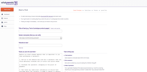
This tool is similar to UserTesting in that the end result is a video of a tester completing and commenting on tasks that you have set. Whatusersdo is slightly cheaper than UserTesting but offers fewer options.
Step 1: Sign up.
Step 2: Select a template test and edit it to fit your website.
Step 3: Select the the age and gender of testers.
Step 4: Preview the test and pay.
Pricing: £30 per user test.
Treejack

This tool is all about measuring and fine tuning your website's structure. It allows you to ask paticipants how they would go about finding something using your website structure.
Participants taking a test are presented with a welcome screen with your logo and colours, then with a page of instructions. Next, they’re given a task and a menu to choose from by clicking ‘I’d find it here’.
Step 1: Sign up.
Step 2: Input your website menu tree.
Step 3: Set tasks.
Step 4: Recruit participants. You can email a link, promote on social media or get help from TreeJack in finding participants.
Pricing: Flat rate of $109 per month.
PageSpeed Insights from Google

Page load speed is one of the most important factors when it comes to making your website accessible to mobile devices.
PageSpeed Insights analyses your page for both mobile and desktop load speed, giving it a score out of 100. Details of fixes needed to improve load speed are given and prioritised as ‘Should Fix’ or ‘Consider Fixing’.
Step 1: Enter the URL you would like to test.
Step 2: See the results.
Pricing: It’s completely free.
Other tools include:
Pingdom Tools – Measures website response time and webpage size.
FiveSecondTest

This tool ties down what participants can learn from your website in 5 seconds. People are busy. They decide in seconds whether or not they think your website can help them. So you only have a short window of opportunity to get your message across.
The Five Second Test starts with two lines of instructions for the user. A task or some context is given to the user then, when they’re ready; they’re shown an image for 5 seconds and quizzed on what they saw.
Step 1: Sign up.
Step 2: Upload print screens to test.
Step 3: Set questions that you would like users to answer.
Step 4: Invite people to take your test. Test responses will also come from UsabilityHub members.
Step 5: View your results.
Pricing: Prices range from $20 per month to $200 per month depending on the number of responses that you would like to collect. All plans work out at $0.20 per response.
Usabilla

Usabilla provides you with functionality allowing your visitors to leave feedback on your website from any device. Feedback forms can be fully customized and additional features are available, which include a slide out panel encouraging visitors to leave reviews, exit surveys, and slide out polls. You can choose when and how these are displayed.
Step 1: Sign up.
Step 2: Create a feedback button.
Step 3: Copy feedback button code into the HTML code of your website.
Step 4: Customise your feedback button.
Step 5: Set up other features such as a slide out panel personally asking visitors to leave reviews, exit surveys, and slide out polls.
Step 6: The results: a dashboard gives you live data.
Pricing: A free 14 day trial is available. After that pricing ranges from $49 per month (less than 100,000 page views per month) to $199 per month (up to 500,000 page views per month).
Feedback Army

This is probably the quickest and easiest of all these applications to set up but its scope is limited. If you are looking for a thorough analysis of your website, this is not what you need. However, if you're looking for yes / no answers to a couple of specific questions, Feedback Army will do the job on a budget.
Step 1: Choose 4 to 6 questions to ask reviewers
Step 2: Preview your test and complete the purchase.
Step 3: See your feedback.
Pricing: Starts at 10 responses for $40 and goes up to 50 responses for $150.
A/B testing is simply where variations of a webpage are alternated between visitors and data on the behaviour of these visitors is compared to ascertain which page converts at a higher rate.
Google Analytics Content Experiments
In Google Analytics Content Experiments you can set up experiments comparing up to 5 different variations of a page to see which preforms better against criteria you set up.
Step 1: Go to the experiments section of your Google Analytics account. Reporting > Content > Experiments > Start Experimenting.
Step 2: Choose your objectives.
Step 3: Identify your original and variation pages.
Step 4: Add the experiment code to your website and check it’s working.
Step 5: Review and start your experiment.
Step 6: Make any tweaks and changes.
Pricing: Free.
Convert

Convert has an easy to use visual tool which allows you to create variations of a webpage to test in A/B tests. It's actually an extension of Google Analytics Experiments and integrates the A/B test results into your account as custom variables.
Step 1: Enter your URL.
Step 2. Edit element of the page to make unique variations of the page.
Step 3. Place a Java code snippet into the HTML header of your webpage.
Step 4. Review the results in your Google Analytics account.
Pricing: Starts from $9 per month and ranges to $99 per month depending on your requirements, you can also trial the product for 15 days.
Optimizley
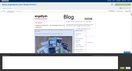
Similar to Convert, Optimizely helps you create multiple variations of a page, and track how these variations perform. You can easily reword copy and move, resize or change the formatting of elements. Then you can test the page variations against each other to see which converts better.
Step 1: Enter your URL.
Step 2. Edit elements of the page to make unique variations of the page.
Step 3. Create goals, e.g. how many people click the 'Add to Cart' button.
Step 4. Choose your audience, e.g. returning visitors.
Step 5. Place a Java code snippet into the HTML header of your webpage.
Step 6. Launch the A/B test and watch the results.
Pricing: Starts from £12 per month and ranges to £243 per month, but a free 30 day trial is available so you can try before you buy.
Crazy Egg

Crazy Egg is a heat map tool that allows you to see where visitors are clicking and how they scroll over certain page. This information shows you where users want your website to be clickable. You can also see who clicks what, as the data can be broken down showing where different referral visitors clicked. It's easy to compare two different page designs at a time to give you further insight into A/B testing.
Step 1: Sign up.
Step 2: Tell Crazy Egg which page you want to track.
Step 3: Start viewing the data.
Pricing: Starts a $9 per month and is billed annually.
We hope this article has been useful in helping you decide which usability tests you should use to measure and improve conversion on your website. If you've got any other usability test resources to recommend, please add them in a comment below.
(By the way, none of these are paid reviews.)
1. Tools for task analysis (how easy it is to complete a task)
Intuition HQ is a task analysis tool which asks participants complete certain tasks on your website. Data on how long each process task takes, where participants click to complete the task as well as feedback are available to you.
Step 1: Sign up.
Step 2: Set up a test. Think about tasks that you want your visitors to complete and set these up in Intuition HQ.
Step 3: Go live with your test. Intuition HQ will provide you with a link to each test to share the link to get participants to take your test.
Step 4: The results. At any point you can access a report detailing how long it took participants to complete a task, where they clicked and how many times.
Pricing: The free account allows you to conduct 10 live tests, with an unlimited number of questions and 350 participants.
Loop11
Loop11 allows you to set up usability tests without an in depth knowledge of code. It provides you with figures showing how many visitors successfully complete, fail to complete or abandon a task.
Step 1: Sign up.
Step 2: Create tasks and ask visitors questions about those tasks.
Step 3: Customise the look of your test.
Step 4: Promote your test url to get participants to take part.
Visitors will see an introduction page, optional instructions, then the task is given in a task bar across the top of the website, with a complete or abandon button.
Pricing: This tool is a little more costly, you can pay monthly or $350 per project.
UserTesting
The difference between this tool and the two above tools is that UserTesting will recruit the participants for you. These testers are paid to review your website according to the tasks and questions you set. Another unique point is that the process is recorded and narrated by the testers - usually these videos are available within an hour or so of setting up the test! (You also receive a written summary.)
Step 1: Select your target audience.
Step 2: Add your URL and instructions on the 'mindset' that participants should have.
Step 3: Then add tasks and post-test questions for the participants.
Step 4: Review the test, sign up and pay.
Whatusersdo
This tool is similar to UserTesting in that the end result is a video of a tester completing and commenting on tasks that you have set. Whatusersdo is slightly cheaper than UserTesting but offers fewer options.
Step 1: Sign up.
Step 2: Select a template test and edit it to fit your website.
Step 3: Select the the age and gender of testers.
Step 4: Preview the test and pay.
Pricing: £30 per user test.
2. Tools to measure site navigation
Treejack
This tool is all about measuring and fine tuning your website's structure. It allows you to ask paticipants how they would go about finding something using your website structure.
Participants taking a test are presented with a welcome screen with your logo and colours, then with a page of instructions. Next, they’re given a task and a menu to choose from by clicking ‘I’d find it here’.
Step 1: Sign up.
Step 2: Input your website menu tree.
Step 3: Set tasks.
Step 4: Recruit participants. You can email a link, promote on social media or get help from TreeJack in finding participants.
Pricing: Flat rate of $109 per month.
3. Tools to test page load speed on mobile devices and desktop
PageSpeed Insights from Google
Page load speed is one of the most important factors when it comes to making your website accessible to mobile devices.
PageSpeed Insights analyses your page for both mobile and desktop load speed, giving it a score out of 100. Details of fixes needed to improve load speed are given and prioritised as ‘Should Fix’ or ‘Consider Fixing’.
Step 1: Enter the URL you would like to test.
Step 2: See the results.
Pricing: It’s completely free.
Other tools include:
Pingdom Tools – Measures website response time and webpage size.
4. Tools to measure how learn-able your website is
FiveSecondTest
This tool ties down what participants can learn from your website in 5 seconds. People are busy. They decide in seconds whether or not they think your website can help them. So you only have a short window of opportunity to get your message across.
The Five Second Test starts with two lines of instructions for the user. A task or some context is given to the user then, when they’re ready; they’re shown an image for 5 seconds and quizzed on what they saw.
Step 1: Sign up.
Step 2: Upload print screens to test.
Step 3: Set questions that you would like users to answer.
Step 4: Invite people to take your test. Test responses will also come from UsabilityHub members.
Step 5: View your results.
Pricing: Prices range from $20 per month to $200 per month depending on the number of responses that you would like to collect. All plans work out at $0.20 per response.
5. Tools to measure user satisfaction
Usabilla
Usabilla provides you with functionality allowing your visitors to leave feedback on your website from any device. Feedback forms can be fully customized and additional features are available, which include a slide out panel encouraging visitors to leave reviews, exit surveys, and slide out polls. You can choose when and how these are displayed.
Step 1: Sign up.
Step 2: Create a feedback button.
Step 3: Copy feedback button code into the HTML code of your website.
Step 4: Customise your feedback button.
Step 5: Set up other features such as a slide out panel personally asking visitors to leave reviews, exit surveys, and slide out polls.
Step 6: The results: a dashboard gives you live data.
Pricing: A free 14 day trial is available. After that pricing ranges from $49 per month (less than 100,000 page views per month) to $199 per month (up to 500,000 page views per month).
Feedback Army
Step 1: Choose 4 to 6 questions to ask reviewers
Step 2: Preview your test and complete the purchase.
Step 3: See your feedback.
Pricing: Starts at 10 responses for $40 and goes up to 50 responses for $150.
6. Tools for A/B Testing
Google Analytics Content Experiments
In Google Analytics Content Experiments you can set up experiments comparing up to 5 different variations of a page to see which preforms better against criteria you set up.
Step 1: Go to the experiments section of your Google Analytics account. Reporting > Content > Experiments > Start Experimenting.
Step 2: Choose your objectives.
Step 3: Identify your original and variation pages.
Step 4: Add the experiment code to your website and check it’s working.
Step 5: Review and start your experiment.
Step 6: Make any tweaks and changes.
Pricing: Free.
Convert
Convert has an easy to use visual tool which allows you to create variations of a webpage to test in A/B tests. It's actually an extension of Google Analytics Experiments and integrates the A/B test results into your account as custom variables.
Step 1: Enter your URL.
Step 2. Edit element of the page to make unique variations of the page.
Step 3. Place a Java code snippet into the HTML header of your webpage.
Step 4. Review the results in your Google Analytics account.
Pricing: Starts from $9 per month and ranges to $99 per month depending on your requirements, you can also trial the product for 15 days.
Optimizley
Similar to Convert, Optimizely helps you create multiple variations of a page, and track how these variations perform. You can easily reword copy and move, resize or change the formatting of elements. Then you can test the page variations against each other to see which converts better.
Step 1: Enter your URL.
Step 2. Edit elements of the page to make unique variations of the page.
Step 3. Create goals, e.g. how many people click the 'Add to Cart' button.
Step 4. Choose your audience, e.g. returning visitors.
Step 5. Place a Java code snippet into the HTML header of your webpage.
Step 6. Launch the A/B test and watch the results.
Pricing: Starts from £12 per month and ranges to £243 per month, but a free 30 day trial is available so you can try before you buy.
Crazy Egg
Crazy Egg is a heat map tool that allows you to see where visitors are clicking and how they scroll over certain page. This information shows you where users want your website to be clickable. You can also see who clicks what, as the data can be broken down showing where different referral visitors clicked. It's easy to compare two different page designs at a time to give you further insight into A/B testing.
Step 1: Sign up.
Step 2: Tell Crazy Egg which page you want to track.
Step 3: Start viewing the data.
Pricing: Starts a $9 per month and is billed annually.
We hope this article has been useful in helping you decide which usability tests you should use to measure and improve conversion on your website. If you've got any other usability test resources to recommend, please add them in a comment below.
Subscribe to:
Posts (Atom)